The strip chart. Can't live without it.
The classic strip chart is the MRTG network utilization graph. MRTG and its companion RRDTool have to rank as some of the most useful system and network administration software ever written. The world is full of interesting uses for RRDTool and MRTG.
As part of normal application, server and network monitoring we generate about 2500 strip charts every 5 minutes.
Here's examples of how we use them:
Long term trends
Yep -the network load at this site follows an annual calendar, and appears to have grown quite a bit last fall. But then it leveled off this spring. The bandwidth management appliances must be doing their job.
Application load
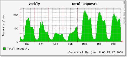
Application load, as measured by HTTP hits/second, peaks on Mondays, declines dramatically on Saturday, and starts to ramp back up Sunday night. That's good to know. Sunday night is as almost busy as Friday afternoon. And of course this isn't a 'follow the sun' application. It's really only used in a single time zone.
Detecting problems
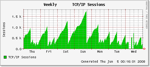
Does anyone feel like helping track down a connection pool leak?
This is awful. TCP connections from an app server to database shouldn't saw tooth like that. We have 1700 open TCP sockets on a single server. Probably 100 of them are in use. The rest are stale, dead, hung or something.
Something has changed
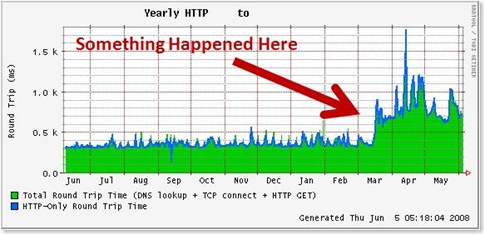
Round trip time to get a dynamic HTTP page on this application more than doubled a few months ago. Presumably we could go back through a change log and determine what we might have done that caused the response time to change so dramatically. Lets see...the second week of March.....Hmmmm...
Detecting Anomalies
That 500Mbps spike at the beginning of week 19? A denial of service attack, perhaps likely. At least we know that the routers on each end of that circuit can handle 500Mbps.
Reconstructing Events
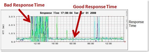
We know that application response time was bad on Monday. Users told us. Lets dissect the event.
Yep, it was bad. 3.0k ms = 3 seconds. You can see normal response time (RTT) is something closer to 250 ms. For us, 3 seconds is bad. For my bank, my cell phone company, 3 seconds about normal.
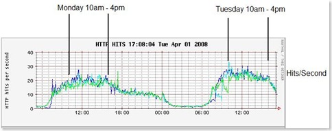
Let's see if it was related to web application load. Maybe we had unusually high user generated load.
Nope - not user load related. Monday was just another day.
Lets check the back end database servers.
Dang - that's bad. The green server was buried. And yep - the times line up. From 10am to 4pm.
I wonder what process on the server was using up the cpu?
Look like to me like the red database was the culprit. Of course an Oracle AWR report will let us drill down into the period in question. (Notice also that the blue database has a half-hour periodic CPU spike. There probably is something in either crontab or the Oracle scheduler that will explain that, like perhaps a materialized view that someone needs refreshed twice per hour.)
Conclusion
Strip charts don't help much for up-to-the second performance or troubleshooting data. The operating system or database built in tools are much better for that. But for the types of uses outlined here, strip charts can't be beat.
MRTG and RRDtool are limited only by Perl, which has no limits.

